Thursday 8 December 2011

Shooting Schedule

Day of the Shoot: Saturday 28th January 2012, 11am - 4pm

We haven't got an exact plan, as it's difficult to predict how long each part of the day will take. but here's the order in which we're going to do things:

Briefing the Cast - Show the whole cast the draft video and explain exactly what they're going to be doing. They already have an idea of what's expected, but it will be more definite.

Costume and Make-up Checks - The cast have already been informed about their costume etc. as I've been keeping in touch via Facebook and Twitter. However, we'll still need to check on the day to make sure that they all look how we want them to!

Filming the Outdoor Scenes - There are two scenes that are outside; when the group of friends get into the car (which includes Neighbour Bob's appearance)and then out again. We've decided to shoot them first because it needs to be light and that should be the lightest  part of the day.

Filming the Crowd/Performance Scenes - This will be the longest part of the day as we have to get a lot of different shots. so this means we'll be filming the same thing again and again but from different angles. Doing this earlier on means the cast won't get so bored and once we've finished, they'll be able to leave. It's difficult to manage a large group of people on set, so the less time we have to do it, the better.

Filming the Narrative Scenes - This makes up the majority of the video and only includes six members of cast, so should be easier to manage. We don't have a particular order, but we'll film scenes that are similar together. For example; scenes that include 'The Parents', scenes that include 'The Friends' and scenes that are just the main character.


  These are three pages of our storyboard; we sat and discussed the shots we wanted and I did the sketches. We plan to use our storyboard as a sort of checklist on the day of the shoot, in order to make sure we get the shots we need.

Director's Pitch

Props
A Guitar, a Bass, a Drumkit, Amplifiers, Microphones and stands, Mobile Phones, House Phone, Beer Bottles, Forest's car.

Locations
Forest's Grandma's house - Living room, kitchen, hallway, front of the house.
Forest's house - Forest's bedroom.


Cast


We decided that we wanted three boys that looked similar and that were already musicians, so that they could mime convincingly. Jake, Tom and Taliesin are aged 18, 17 and 16 respectively and all dress in a similar style, which also suits the style of music as well. Therefore, all three are quite well cast, as they already fit the bill without having to change much.
More importantly, Tom and Taliesin are also very willing to dress up as the characters of 'Mom and Dad'.

We then have a large group of friends who will randomly be assigned roles on the day to being part of the Protagonist's small group of friends, or just part of the larger crowd.


Pitch
*Video begins with performance footage.
The narrative begins on a shot of the main character (band frontman Jake) sitting around with a group of three friends in a living room. One friend is passed out on the floor. Then there's a shot of the character Mom (who is also the band's drummer, Taliesin) walking in through the back door and calling out. The Protagonist hears her enter and panics. He and his friends run out of the room, returning to pick up the passed out friend. they run outside to their car, the Mom following close behind. Neighbour Bob appears from behind a garden fence and watches the group of friends run to the car. Then there is a flashback to the Protag sitting on his bed. He receives a text from a girl, thanking him for 'last night'. The scene fades back to 'the present', as the kids drive off, Bob waving and the Mom shaking her fists.
* Cut to performance footage.
Next, the Protag and his friends walk into the house, looking kind of rough. The parents look angry. The camera zooms in on a lipstick stain on one of the friends' cheeks and the parents shout at the kids.
* Performance footage.
At another time, the Protag walks into the house alone and faces his parents in the kitchen. There is then a shot reverse shot sequence of the parents shouting at him, and his reaction.
* Performance footage.
The parents bang on the wall of what the audience should assume is an adjacent room to where the band are performing. They eventually give up and walk away.
*Performance footage.
The video ends with cameo/outtakes material, adding an informal element to the video. The following, all videos of the same genre, include this technique:
Nice Guys Finish Last by Green Day
Fat Lip by Sum 41
The Rock Show by Blink 182
The very end of the video is a shot of the band finishing their performance.
Here is our basic plan; we made notes on what would happen in each verse/chorus. It also includes a plan of locations, characters and props.


Justification 
How does this video reflect the genre you have chosen and the brand image of your artist?
My music video reflects the punk rock genre as it represents the modern and American attitude of punk, which involves casual hedonism and personal rebellion against figures of authority - not as intense and political as the first punk movement of the 70s and 80s.
The song itself is about teenage angst versus parents and we've tried to create a video that shows exactly that.
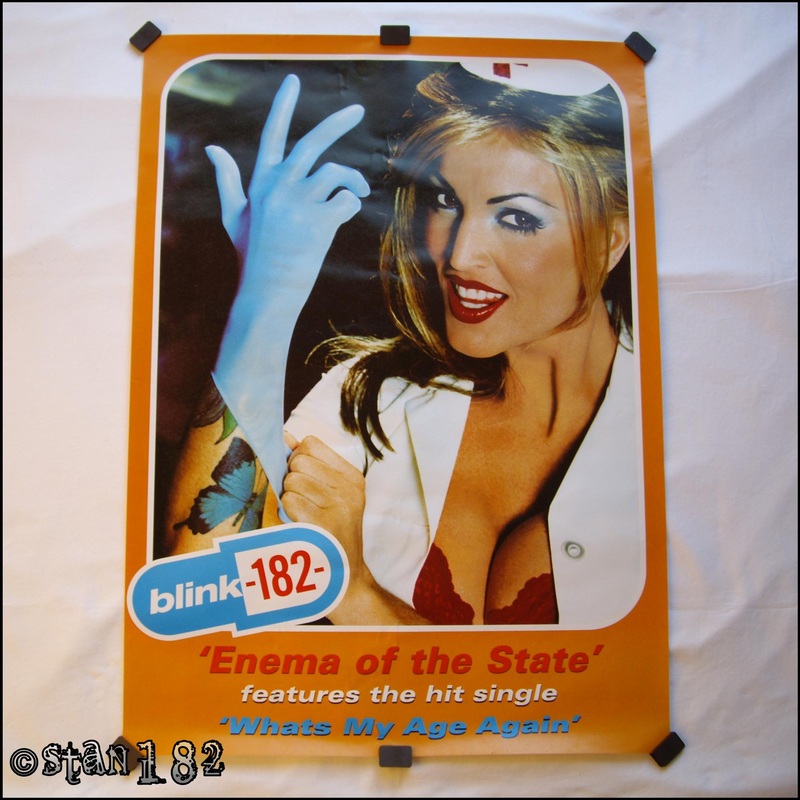
We've decided to dress our band in the style of Blink 182 and the concept for the video is very Blink too - the band have been known to dress up in their videos (see First Date and All The Small Things) so it was an obvious choice to have the band play the parents, and the party/crowd atmosphere appears a lot as well. In fact, these two are common factors in videos by bands like Blink, Sum 41, The Offspring etc. 

Target Audience Feedback: Digipack, Advert and Video

Digipack and Advert Feedback
In order to get some feedback on our draft of the digipack and advert, we simply took my illustrations and asked our friends and peers what they generally thought.
Most people worked out straight away what genre the album is, or which other albums/artists it was similar to. These people liked both the digipack and the advert, saying they thought it fitted the genre well - they also liked the logo we'd created. But the few people that didn't guess the genre straight away didn't like the digipack on first look. When we told them more about the band, they were less negative, and although they still felt like they probably wouldn't pick up the album if they saw it, it fit in with the genre well.

Video Feedback
In order to collect feedback for the video, we got six people to sit in front of the Mac and watch the draft.
To make it clearer what we were trying to show them, Tom and I added extra narration to the video.
At the end, we asked them what they thought of it generally and they seemed positive overall. They all said they liked the storyline and they thought it was funny. They also liked the idea of the band performing in a living room, as it followed conventions of existing music videos of the same genre.
However, two of the audience weren't sure if the idea of having two of the band dress up as the parents would work. They said that the idea was good, and it could be really funny, but they were explained that if we didn't make it obvious enough the parents and band members were different 'characters', then the video could be a little confusing for some viewers.
The group also expressed concern about the idea of having a crowd in the performance shots - they argued that if we didn't have the right space, it could look over-crowded and uncomfortable, and that if not all of the crowd acted well enough, there'd be no atmosphere and it wouldn't be as effective as we would want.

Overall, we're very happy about the feedback and have only decided to make a few changes:
1. After the audience of the video mentioned over-crowding, we decided to leave out the crowd in the video. As well as avoiding the problems that the audience pointed out, it will also be easier for us a Directors, as we'll have less people to try and manage , and to rely on.
2. In light of this change, we will also have to change the design of the back panel of the digipack. Originally, it was going to have a photo of the band from the back of the crowd, but I have drawn up a rough sketch of just the track listing and the band logo.
3. Finally, the band logo will also appear on the front of the digipack rather than a photo of the band, as the general consensus of those we asked, was that just the logo was more like other albums of the genre and would look less tacky.

Draft Video


Here is our draft video - it gives an impression of what the actual video will be like.
We originally planned to do it as stop motion, but then realised that would take too long, so I made the decision to use stills, or just move the figures.

Draft Advert


 For our album advert, we decided to make it quite like our digipack, in order to create brand image and continuity.
Adverts are usually in two categories; they focus on the artist's image or on the artist's brand. Therefore, either the advert features the actual band or artist themselves, or just there logo or album cover.

Blink 182's album Enema of the State was advertised with the latter.

Digipack Draft


We decided to make our digipack very British themed, as Blink 182 are quite an obviously AMerican band and we wanted to parody this.
Many albums we looked at featured the band on the front, as this helps with branding and identity, but we also chose to create continuity by using photos of the band throughout the digipack. We also used the colours of the Union Jack on the front throughout the rest of the panes.
We sat and planned the design together, but I drew it all out and Tom began planning what photos we'd use.

Monday 17 October 2011

Advertisement Deconstructions


Source: Unknown
Date: 2003

This advert is for Blink 182's self-titled fifth album. Regarded as their 'growing up album', Blink 182 has a more serious sound, with lyrics about mixed subjects, like love, alienation, and even World War II.
However, the advert suggests that the band aren't entirely estranged from their previous image, mainly because of the band's clothes - they're still in skater caps and t-shirts, and Travis Barker's tattoos of course.
The font used for 'Blink 182' is more abstract and 'artistic' than other albums, as the others just seemed to reflect the theme of the cover, for example: Dude Ranch is in a western style, and Buddha in an eastern style. However, it is the same font that appears the album and therefore creates continuity between the two.

From there on, the advert follows usual conventions: the image of the album cover, record label logos and the band's website, and 'featuring' line, whereby the album's first/best selling singles are listed and any special additional material, in this case, a '15min Enhanced section'. This draws in the audience and makes the fans think they're getting 'more Blink for their money'.


Source: Kerrang! magazine
Date: 2011

This advert is more simplistic than the previous, as it is simply the album cover. The font used is continuous through the album's promotion, as it also features on the website in places, as well as in the artwork for the mentioned single, 'Up All Night'.
The font is similar to graffiti styles, which fits with the album's theme (and title) of 'Neighborhoods'.
However, like the previous advert, it features the same information: The band name, the album title, 'featuring' line an release date, as well as the record label logos and band website.

Wednesday 21 September 2011

Artist Research

Blink 182
In August 1992, Tom DeLong and Mark Hoppus were introduced,and along with their friend Scott Raynor, they started a band, called Blink. However, after six years, Raynor left and was replaced the drummer recognised today, Travis Barker.

Blink 182 are one of the most influential bands from the late 80's and the 90's, alongside other American punk acts like Green Day, The Offspring and Rancid that developed and built on the loud and fast melodic sound of bands such as The Ramones, Buzzcocks and The Jam. Essentially, these new bands were evolving into the new sub-genres of pop-punk and hardcore punk, for the children of music fans that were Punks the first time round.
These bands were all remarkably successful, selling out stadiums and arenas, albums reaching as much as double-platinum status and winning many prestigious awards. For example, the 1999 album Enema Of The State reached 5x Platinum in the US and the band received the 'Best Group Video' MTV award in 2000.

Regarding image, 'Blink-182 songs are known for their simple melodies, teen angst and occasional lyrical toilet humor. They are often targeting subjects such as love and growing up' and despite more serious and emotive songs, like Adam's Song, Miss You and Stay Together For The Kids (among others), the band have retained the image of three immature guys from the west coast skate scene.

However, even though the band have reached iconic status, they have still faced, and caused, a lot of controversy. Similarly to Green Day, Blink 182's sense of humour has often caused trouble, as both bands have made touchy comments about politicians and celebrities in lude and crude suggestiveness.
But Blink 182 found themselves in the firing line in a completely different situation, when it was reported in May 2000 that one of the Columbine survivors, Greg Barnes, had put the Enema Of The State hit Adam's Song on repeat when he hanged himself in the family garage. A few weeks later, a magazine called Launch reported that ' The band sympathizes with the loss, but singer/bassist Mark Hoppus told LAUNCH that people need to sit down and listen to the lyrics to get the inherently positive message in the song. "Any intelligent person that listens to that song will know that it's an anti-suicide song, and so if you listen to the lyrics it's pretty self-explanatory that it's about going through a hard time and finding the strength to go on," he said. "It was a very unfortunate thing that that happened and our heart goes out to the kid's family, but the song itself. . . I think the message is pretty clear actually." 'All the same, this wasn't something that was held against the band, and the album went on to sell a further 15 million copies.

Unfortunately, Blink 182's rocketing success soon became too much for their friendship to survive. Tensions rose after the December 2004 European tour, but six months later, Tom split from Mark and Travis in a dispute over the new record and Blink 182 were no more.
The two sides threw themselves into new projects and didn't communicate again until late 2008. But it was after Travis barely survived a horrific plane crash that the band finally reconciled their differences and on 8th February 2009, the band appeared onstage together at the Grammys.

The album Neighbourhoods is set to be released and a world tour has been post-poned for next year.

Blink 182 are very in-touch with their fan base, and much of their marketing is reliant on the relationship between the band and the fans. Originally, Blink 182 took the traditional punk DIY attitude, touring around the US in a van and giving out demos. But as the band and technology has developed, these days, the band constantly communicate directly with their fans via social networks, like Facebook and Twitter, which appear in a direct feed on the band website as well. The website also has a chat system which automatically adds in anyone who goes on the site, allowing fans to chat amongst themselves and further share information about tour dates and releases.
Blink 182 have become a band of the mass market, as they appear on mainstream radio and TV stations, and in many magazines and newspapers. It's also proved in their album sales, as even when the band were on their 'indefinite hiatus', albums still sold and as soon as the new album Neighbourhoods was available for pre-order, millions were sold.

Artist and Song Choice

We have chosen the song Anthem by Blink 182 from their third album, Enema Of The State, which was released on 1st June, 1999 and was produced by Jerry Finn.

We decided that Blink 182 were a good representative of contemporary pop-punk, as their videos tend to follow genre characteristics (such as featuring 'genre characters' and things like large groups of people at a party or generally being chaotic). We chose Anthem as it's from the band's most successful album to date, selling 15 million copies so far, but also because the theme of the song allows us to include afore mentioned genre characteristics and further fulfil Andrew Goodwin's theories. We considered three other songs from the album - Going Away To College, Aliens Exist and The Party Song - but after creating a pros and cons list, we settled on Anthem, as it was most appropriate for our task and our ideas about the video are more realistic and easier to do than the ideas we had for the other songs.
'The album artwork for the album consists of three simple and bright colors: red, white, and blue. A hospital and medicine theme is sported throughout the album liner notes and artwork. The lyrics are present in the liner notes, keeping in line with all previous Blink-182 albums. A portion of the enclosed booklet with the album features a panorama of men posing in just underwear – Blink-182 members Tom DeLonge, Mark Hoppus, and Travis Barker included. The only person fully clothed is a midget, pointing at Hoppus. The images were replicated for the gatefold packaging of the vinyl release in 2009.
Porn star Janine Lindemulder is the nurse famously depicted on the cover of Enema of the State. The cover shoot for the album was held March 12, 1999. She is also featured in the music videos for "What's My Age Again?" and "Man Overboard". The original version of the album (without the Parental Advisory sticker, as mentioned in the previous section) featured Lindemulder in a nurse cap displaying the American Red Cross logo. The Red Cross was removed and digitally edited out of all further printings, however, some Canadian pressings still feature the red cross intact and these versions are soon to become rare.' - Wikipedia
 
The front and back cover of Enema Of The State illustrates the immaturity and general inappropriateness of Blink 182 and the sound of the album. Even the title itself is a play on words, based on the film Enemy Of The State.

The song doesn't have an existing video, partly the reason why we chose it (as we felt an exisiting video may influence our own interpretation), but here is a video of just the song:

Target Audience Research

I set up a survey on surveymonkey.com and posted it in forums on blink182.com and greendayauthority.com as the fans on these sites are exactly my target audience. It also meant I could get results from people of all ages and from other countries very easily. I left it open for 4 days and collected 55 results.

Gender 
42:13 Females:Males

Age
(Only 51 of the 55 chose to answer this)


Firstly, I asked how the fans get their music; surprisingly, all those asked answered they buy CDs, but this CDs are closely followed by both legal and illegal downloads, which, combined is 53 out of 55. The amount of downloads, along with the fact that again, 53 out of 55 people said they find new music via the internet, shows the relationship between the music industry, how fans consume music and Web 2.0 - the internet makes music even more accessible and the price of downloads is cheaper than CDs. Artists no longer need record labels to produce and sell music, as they can just put it up on iTunes and then market it through social networking sites like Facebook, Twitter and Youtube. Already established artists use the internet to easily market new products to their audiences and which also creates a familiarity between the artists and fans.

Vinyl and Tape has recently made a comeback and considering that first wave punk was prior to the CD era, a respectable 12 out of 55 said they still bought music on these archaic forms (these 12 were aged between 18 and 29, the mode average being 19).

I then asked how fans find out about new music, a really important piece of research for marketing.

Unsurprisingly, most people answered with 'Internet', showing the dominance of Web 2.0 in advertisement, marketing and sales.  This means that in order for a band to be successful, they need to exploit social media sites etc. when advertising new videos/albums/singles, they're merchandise range and tour information.

Finally, I asked the most important question about music consumption; how much do fans spend on music and gigs each year.
As my survey sample have come from all over the world, I'd answers in Australian, US and Canadian Dollars, GBP and Euros. However, the amounts ranged from around 40 (GBP) up to the 1000s, in all the currencies. Many people said they spend more on gigs than actual music, supporting the numbers that admitted to illegally downloading their music.


Music Video Deconstruction #2

Want You Bad by The Offspring, from the album Conspiracy Of One, 2000.
Directed by Spencer Susser.


Genre Characteristics and Relationship Between Lyrics and Visuals
As many punk bands seem to do, this video includes a large crowd of people - and they're partying, another similarity between this and other American punk videos. As I said previously about Frank Turner's video, this is a key part of videos like this, as the crowd shows the 'I Don't Care' attitude and individuals in the crowd can also represent the genre. For example, in I Want You Bad shows 'characters' of the pop-punk genre, wearing band t-shirts and wristbands, with tattoos and chains on their jeans, as well as girls with long straight hair, the skater look, as seen on Avril Lavigne.

Relationship Between Music and Visuals
There is a lot of on-beat editing in this video, as shots of the band performing is chopped up at every sequence in which they appear, as well as increased saturation in places. However, the narrative part of the video, where the main character is walking around the party, trying to find some action. This in itself is part of the relationship between music and visuals, as the title is a play on words, with the narrator of the song saying to his girlfriend he wants her "to be bad" in a dominatrix way, rather than he wants her "badly" - the main character is obviously suggesting this sort of thing to the girls he speaks to for them to act so offended to the point of actually slapping him.
In a less sexual way, the rest of the party quickly become more rowdy and chaotic, acting 'badly', as more of the exploding Offspring cans are opened and foam goes everywhere.

In Regard To Andrew Goodwin's Other Theories
According to Goodwin, Want You Bad is narrative, as the video effectively tells the story of the song, but also features shots of the band performing.
Goodwin also said that music videos refer to 'the notion of looking' - this occurs in Want You Bad in less obvious ways than in the Frank Turner video. Firstly, one caould argue that this theory includes the main character, as he is looking round the group of people. Also, when the band appear in the video, they're looking directly at the audience through the camera, rather than the crowd in the video. Finally, the girl at the end of the video, who accepts the main characters offer, looks at the camera whilst laughing and smiling.

Music Video Deconstruction #1

Try This At Home by Frank Turner, from the album Poetry of the Deed 2009.
Directed by Ben Morse.


Genre Characteristics and Relationship Between Lyrics and Visuals
Although not obviously, this video is quite representative of punk. The main point is that the video is 'DIY', an important part of the punk attitude, something that the lyrics of the song also reflect. The lyrics encourage listeners to have a go and become musicians themselves, and the video shows Frank getting people musically involved in the video, even people who obviously aren't used to holding a guitar or keyboard etc.
Also, the video is made up of large groups of normal people having fun, surrounding the artist and one could imply that they're also 'joining the artist's revolution'. Though this is not a characteristic of older punk videos by the true founders (such as Ramones or The Clash), it has become a common part of videos by modern American bands like Green Day, Blink 182, Sum 41 and Good Charlotte.


Relationship Between Music and Visuals
There is a lot of on-beat editing, but it's not a key element of the video.

In Regard To Andrew Goodwin's Other Theories
Firstly, according to Goodwin, Try This At Home is a performance video.
He also said that music videos refer to 'the notion of looking' - this happens in this video, as people in the video are performing and looking at the person who is watching, directly addressing the audience.

Digipack Deconstruction #2

The CD is London Calling by The Clash, first released in 1979 on Columbia Records.

FRONT COVER
One of the most iconic album covers of all time, London Calling shows bassist Paul Simonon about to smash up his bass onstage at New York Palladium on 21st September 1979. The cover has become the representative image of punk rock and the album itself is frequently mentioned by musicians as being one of the most influential albums ever.
The front cover is a black and white photo, leaving it grainy and slightly blurred, reflecting the base idea of punk being DIY. The album title stands out far more than the band name, as ‘The Clash’ is in a small, plain white font at the top, but the album title 'London Calling' is in a large, bold, coloured font. Graphic designer Ray Lowry put together the artwork as a hommage to Elvis Presley's self-titled debut album.

 
DISC TRAY
In the disc tray is a black and white photo of the band, looking very serious. This creates familiarity between the band and the audience, but also allows the band to give themselves an image - they're not just the chaotic punks that smash guitars, like on the front cover, but they're also serious musicians and their music is more than jsut a laugh, it has a message.


THE DISC
The CD itself is incredibly plain, listing the songs as well as the usual credits found on CDs. This was common of CDs produced at the time, like the insert in the front being one piece of folded paper, rather than the more expensive booklet.


THE BACK
This layout is on the back of the case as well as the back of the insert. The two black and white photos show the band playing live, signifying the band's attitude towards their marketing i.e. they took the typical DIY punk approach of focusing on playing live, rather than making numberous albums and EPs. The font of London Calling is a similar style to the font on the front, but the black and white colouring allows continuity between the inside of the insert, the disc and the back of the case.

Digipack Deconstruction #1

The CD is Dookie by Green Day, which was first released in 1994 on Reprise Records.

FRONT COVER
The album cover in conceptual, as it doesn't really refer to any songs in the album. However, in an interview with VH1, frontman Billie Joe Armstrong explained the artwork:
"I wanted the art work to look really different. I wanted it to represent the East Bay and where we come from, because there's a lot of artists in the East Bay scene that are just as important as the music. So we talked to Richie Bucher. He did a 7-inch cover for this band called Raooul that I really liked. He's also been playing in bands in the East Bay for years. There's pieces of us buried on the album cover. There's one guy with his camera up in the air taking a picture with a beard. He took pictures of bands every weekend at Gilman's. The robed character that looks like the Mona Lisa is the woman on the cover of the first Black Sabbath album. Angus Young is in there somewhere too. The graffiti reading 'Twisted Dog Sisters' refers to these two girls from Berkeley. I think the guy saying 'The fritter, fat boy' was a reference to a local cop."
Dookie was heavily criticized on its release for being 'more pop than punk' and after signing to a major label, the band were banned from entering the iconic punk club 924 Gilman Street for 'selling out'. However, the cover of Dookie is representative of the album's sound and message, despite what the critics and fans wanted you to think. The chaotic scene of the front cover not only depicts the environment in which Green Day started out in, but also illustrates the "I don't care" attitude that has become synonymous with modern American punk rock. The two clearest parts of the cover are obviously the band name in the explosion cloud (drawing the eye immediately) and the album title at the bottom.

BACK COVER
The back of the CD case is chaotic again, but in a different way. It's a slightly blurred photo of a crowd at a Green Day gig, including someone holding up a hand puppet of the Sesame Street character Ernie. This, along with the hand-written track-listing, shows the laid-back, sort of DIY punk attitude that Green Day wanted to hold on to.


INSIDE THE BOOK
The inside of Dookie is really interesting, as there's a song on each page, accompanied by an illustration that refers to the lyrics. All in black and white ink, the background is a continuous brick wall and pavement, with bits of litter, posters and graffiti. Yet again, this represents the areahat Green Day grew up in, which is quite apt when the album is about the experience and self-discovery of being a teenager. On the last page of the book, P. Hynes is credited for creating he book, including illustrations and writing out the lyrics.

BACK OF THE BOOK
The back of the book shows the band themselves, meaning the album isn't entirely 'anonymous' and owing the adience to relate to the band. The band are shown to be funny and a bit immature, characteristics shared by the mainly teenage audience. The black and white photos also seem to show the band on tour, which may encourage someone who's bought the album to then see the band live as well, as it proves that the band do actually tour.
At the bottom, the usual information about production, trademarks, the record company and contacting the band is printed in the same hand writing that the lyrics are written in.

Punk Rock: A Brief Overview

Preliminary Task - That's Entertainment by The Jam

Original:


Our version:


My partner Tom and I chose to recreate That's Entertainment by The Jam as it's quite an easy set and has little action, but it's a video that involves a lot of on-beat editing and some interesting lighting.

I got permission to use the school's drama studio, so we had the dark walls and stage lighting at our disposal.

I filmed the video, trying to capture lots of different shots from different angles and of each 'band member', as Tom was playing the Bass in the video.

We then both spent the time to pick the shots we liked and edit them together.